-
 ATLAS HAS UNDERGONEA MAKEOVERFrom making a world of difference, to becoming the dispenser ofFIND OUT MORE
delight –we’ve come a long way. Our vending machines were once
created to provide refreshments for the people –but we realized
that they needed a bigger purpose to exist. -
 DISPENSING DELIGHTWITH THE PUSH OF A BUTTONSince 1980, ATLAS has been in the business of dispensing delight.FIND OUT MORE
What we provide are not vending machines, but a point of destination
in consumers’ daily lives. We look forward to bringing convenience,
an enjoyable shopping experience as well as fun to consumers.
All this, with just the push of a button. -
 OFFERING A WIDE CHOICE OFREFRESHMENT PRODUCTS
AS WELL AS SERVICES
FOR VENDING MACHINESATLAS offers flexibility as well as choice, combined with high levels ofFind Out More
quality and service. We’ve been consistently rated the preferred
refreshment solutions provider. -
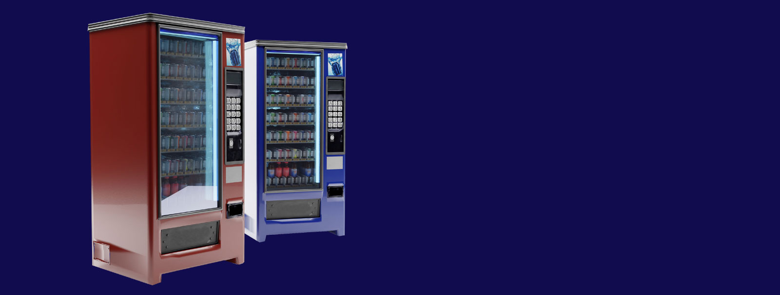 OFFERING A WIDE VARIETY OFVENDING MACHINESTO CATER TO ALL NEEDSATLAS offers a comprehensive range of machines andprovides a one-stop solution for all our clients.Find Out More
 -
 OFFERING TELEMETRY &CASHLESS PAYMENT SOLUTIONSATLAS offers an efficient telemetry technology that provides comprehensive data analysis,remote monitoring as well as cashless payments.Find Out More
 -
 NEWS & PROMOTIONSCheck out what’s new as well as all the current promotions offered by ATLAS.Find Out More
FROM MAKING A WORLD OF DIFFERENCE, TO DISPENSING DELIGHT.
ATLAS has recently undergone a makeover –to modernize and give ourselves a contemporary, yet delightful feel. Coupled with our new promise of dispensing delight to the people –we’re now equipped with a modern & stylistic logo that symbolizes inclusivity and warmth, as well as vivid colours that are attention grabbing and instigators of delight.
The “A” in our ATLAS logo was inspired by an equilateral triangle –as it has equivalent vertices, angles and lines, which symbolizes “inclusivity” as the merging of the three lines represents the brand, our partners and customers in sync together.
Our primary colour, yellow, is one that is most associated with happiness and promotes optimism as well as delight. Our secondary colours, magenta and teal, represent kindness as well as restfulness -which our brand hopes to bring to the world.
With all this and a special emphasis on fulfilling all customers’ refreshment needs as well as delighting them –we continue our mission to be the dispenser of delight, with just the push of a button.
A Quick Yet Delightful Introduction To ATLAS
Find out more about ATLAS with Adam Lobo, as he shares about our milestones, portfolio of customers as well as machine offerings and our stringent processes –all this to ensure we continue being the dispenser of delight.
News & Promotions

Celebrate Unity with ATLAS #SapotSME
ATLAS is looking to make Malaysia Day more meaningful with the new Sapot SME campaign, featuring a multi-brand collaboration involving 13 SMEs, each from a different state in Malaysia. This campaign will kick-off on 16th September 2021, Malaysia Day, and run for 3 months till December 2021.
This initiative is in line with ATLAS’ effort to support local SMEs affected by the COVID-19 pandemic. In this collaboration, the 13 SMEs will be able to use the vending machines to expand market access, reaching a wider audience by offering convenient purchase of their products around the clock from the vending machines. The vending machines will be provided rent-free to the SMEs, with free refilling services for the next three months starting from mid-September onwards.
Get your favourite Kuih Cincin from Sabah, sambal hitam from Pahang and the yummy hiong piah from Perak -amongst many other state favourites!
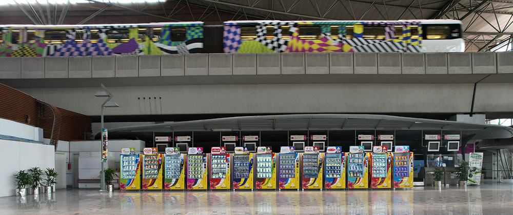
For this campaign, each SME will place Halal-certified local favourites in our machines located at the KLIA Ekspres Departure Hall in KL Sentral.

In addition, given the current situation and to protect customers passing through the KL Sentral travel hub we have also installed 99.99% effective UV light disinfection on the high-contact keypad. To further keep customers safe from UV light exposure, the UV light disinfection feature will be disabled if people are detected nearby by the motion sensors on the machine.
Find out about our campaign & the different participating SMEs on our Facebook page at https://www.facebook.com/atlasasia.co/